


I led identity, UI/UX, photography, and animation for 1835i, delivering ANZ's new venture brand in eight weeks - a system that balanced startup energy with institutional trust from day one.
with Tania Salvati & Rob Homberger
1835i.com is no longer live
Section 01 – The challenge
In July 2021, ANZ spun out its innovation arm, ANZi, launching 1835i - an independent venture-scaling business bridging corporate banking and startup culture.
Faced with tight deadlines, the challenge was building a brand from scratch that balanced entrepreneurial appeal for founders with the institutional credibility and 185-year backing of ANZ.
Section 02 – The process
Eight weeks. One team. Everything from scratch.
Partnering with 1835i’s leadership team, we built a complete brand and product system in real time as the organisation defined its direction.
Identity first
 Identity first
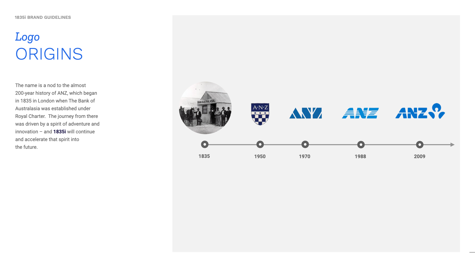
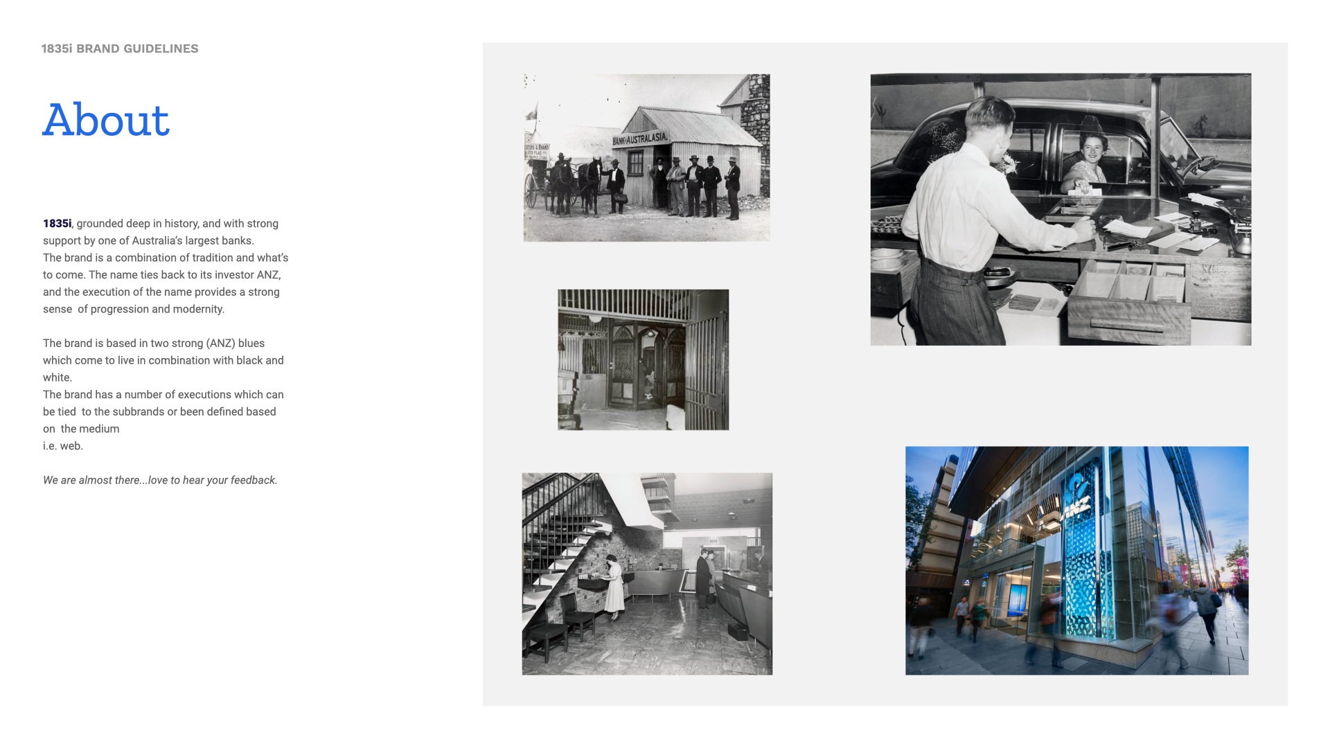
Rooted in history, 1835i subtley honors ANZ's founding year (1835) without explicit referencing. The brand system balances institutional credibility with kinetic energy:
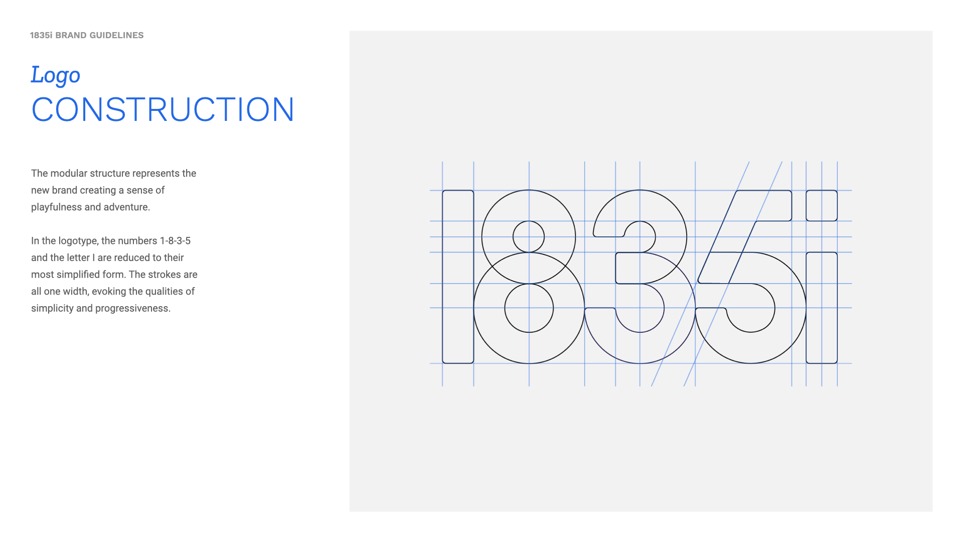
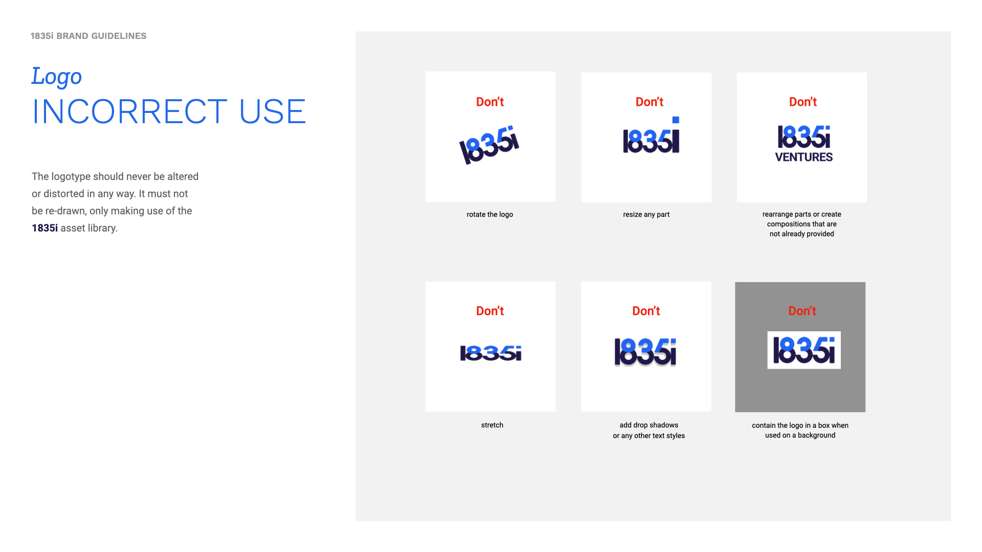
- Logotype: Dual-weight typography in dark navy and bright blue creates a precise mark suited for both boardrooms and merchandise.
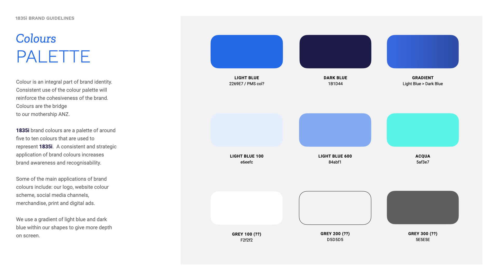
- Palette: Built around ANZ blues, supported by light blue gradients, aqua, and structured greys.
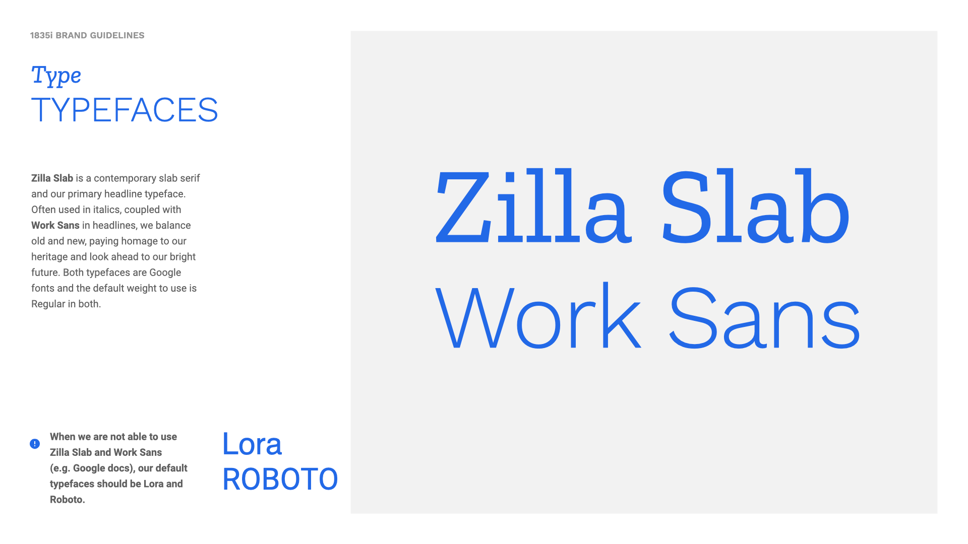
- Typography: Pairs Zilla Slab for authoritative headlines with Work Sans for high-density legibility.
System building
 System building
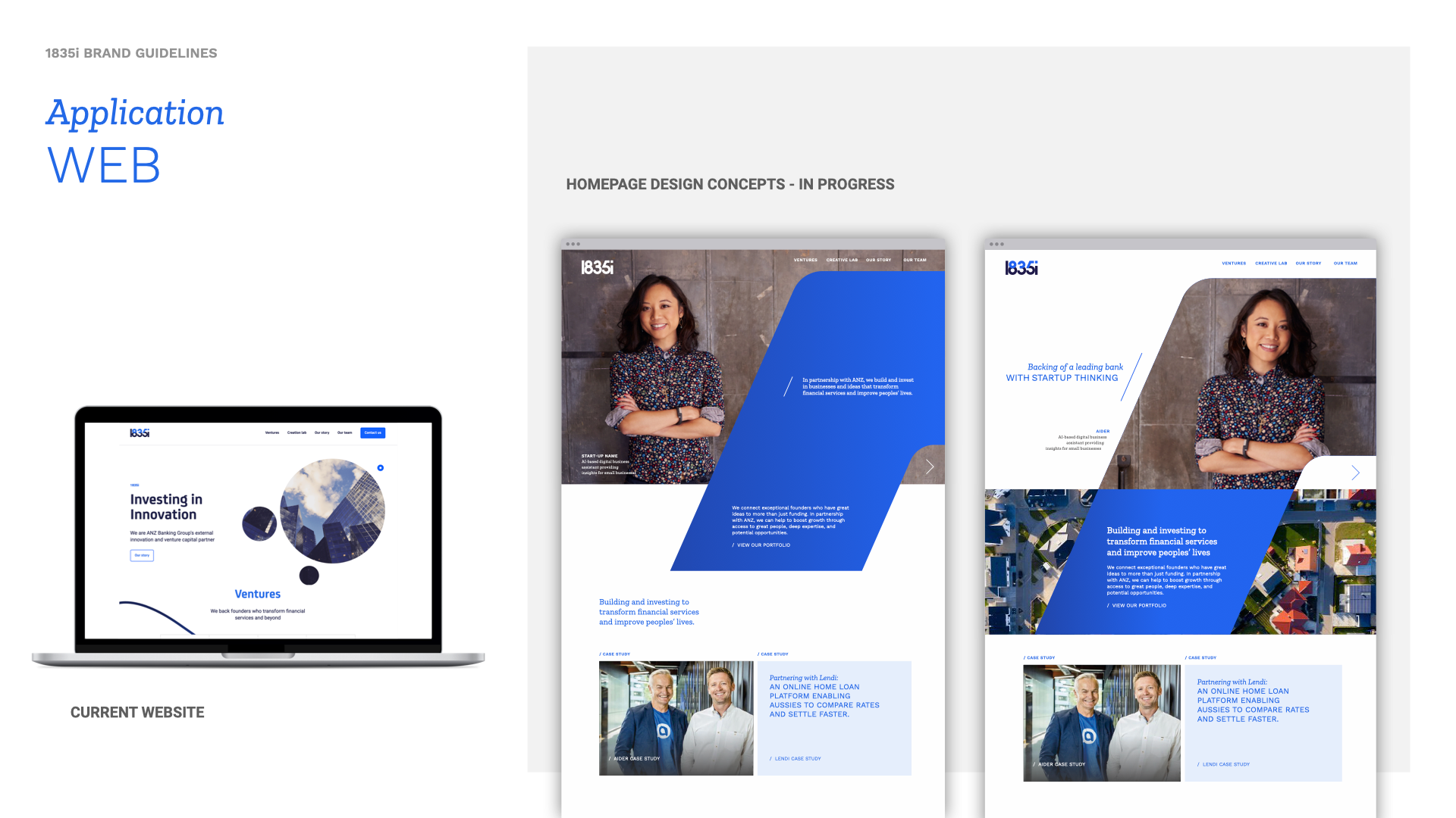
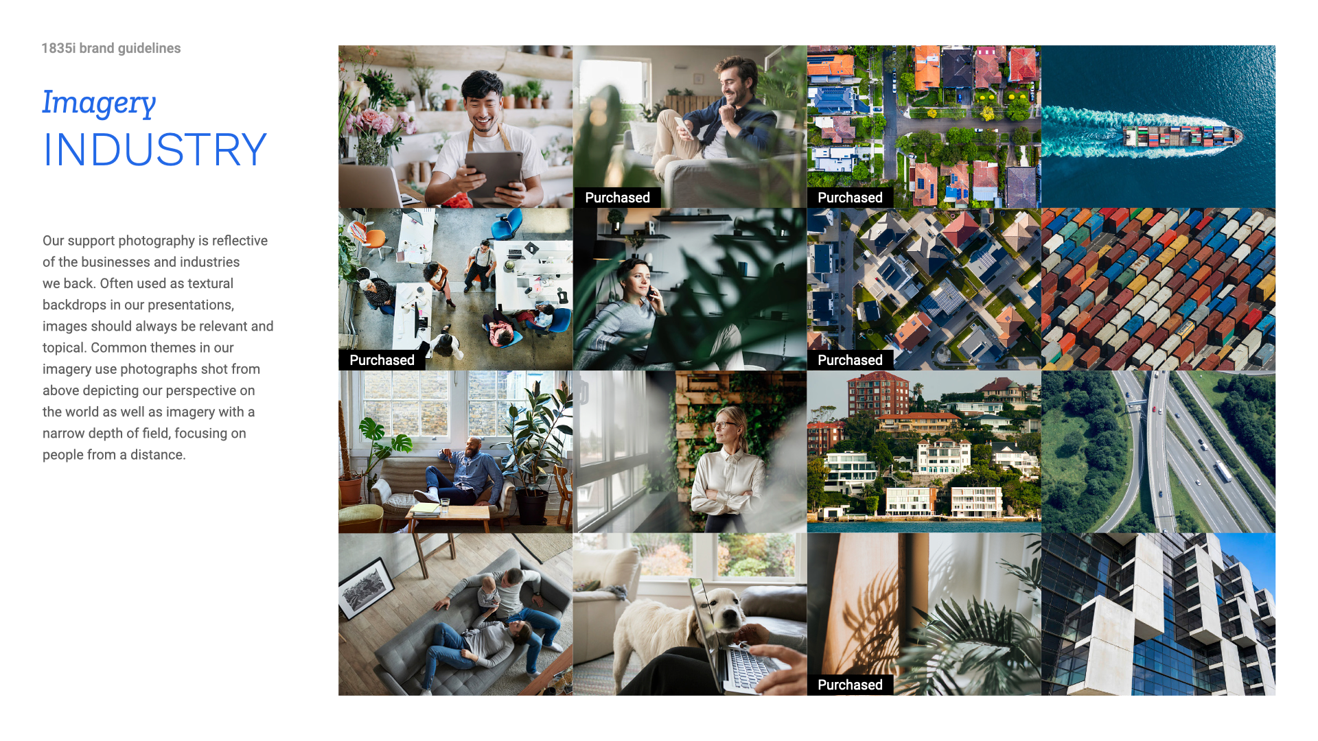
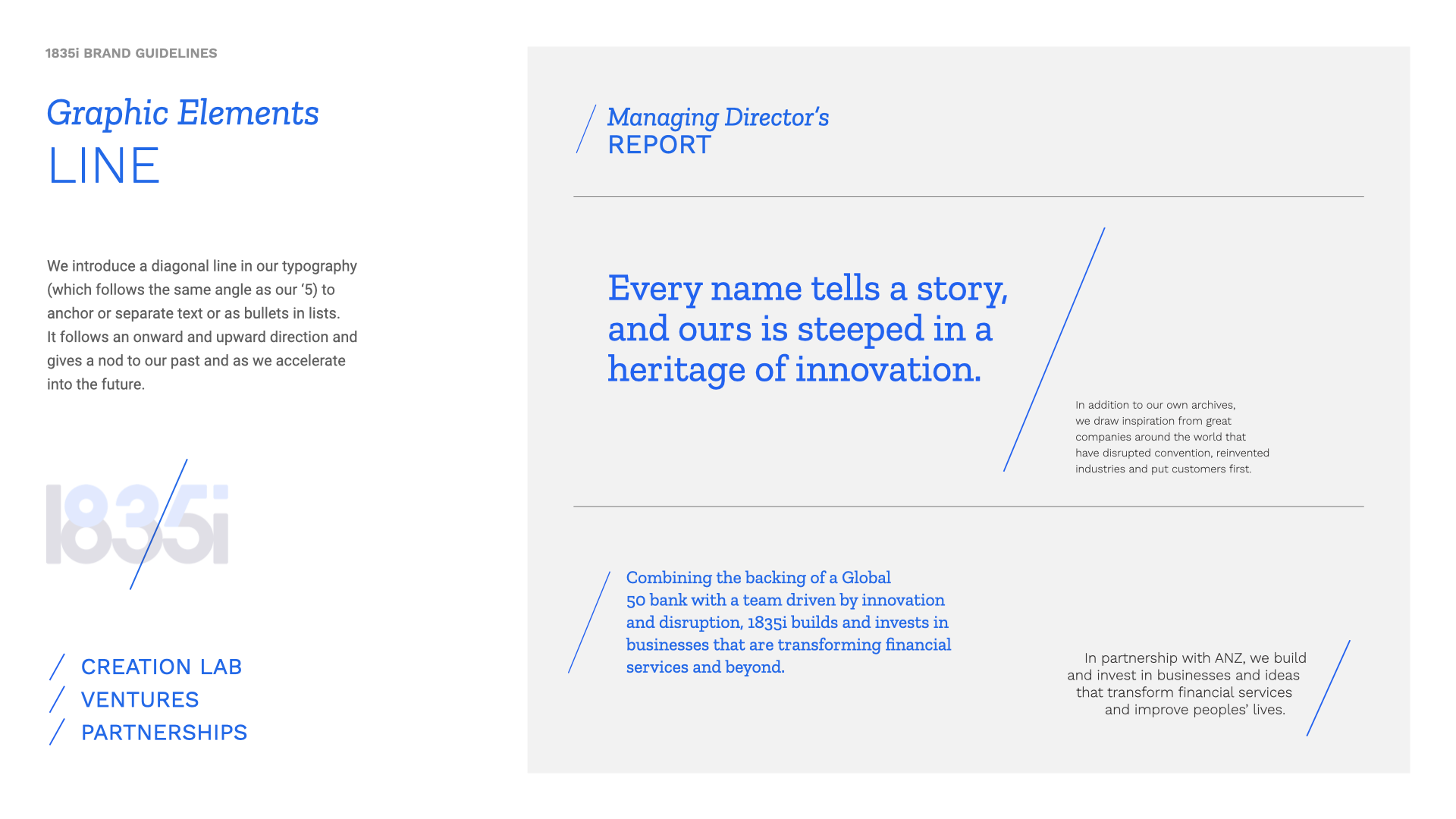
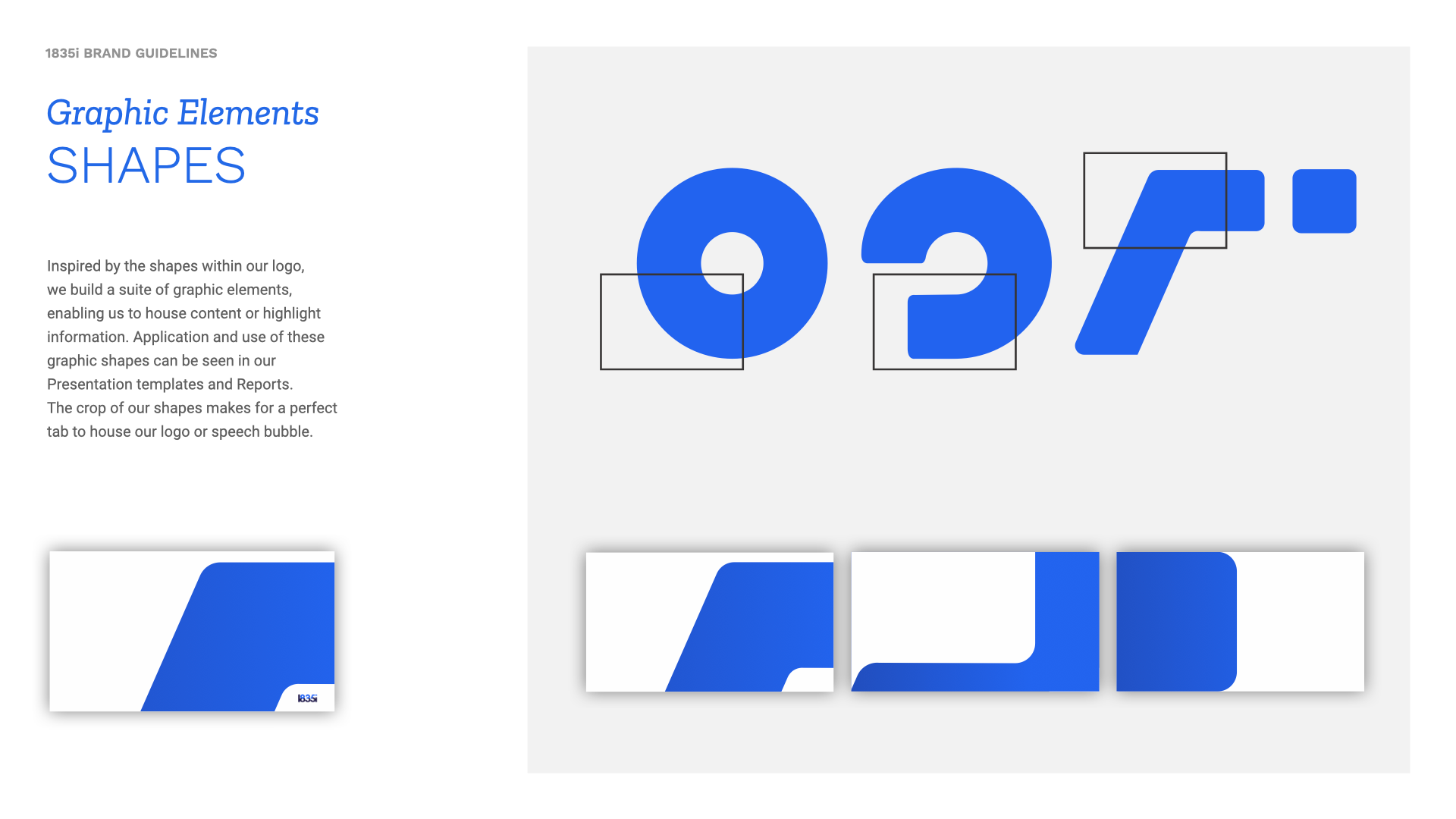
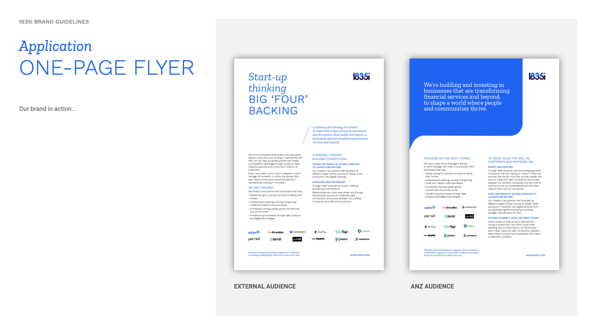
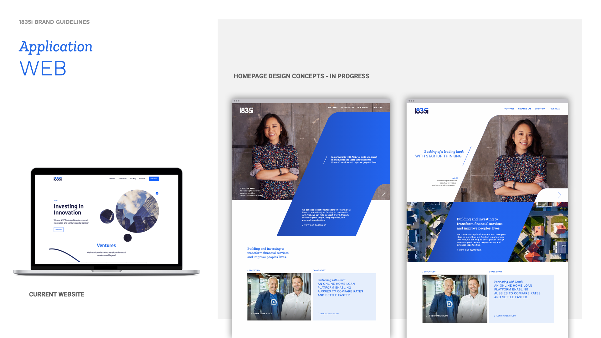
We expanded the identity across every brand touchpoint–documenting full guidelines, designing website concepts, creating investor decks and report templates, and developing office signage. Graphic shapes derived directly from logo letterforms create a scalable visual language without relying on stock imagery.
Video & motion
 Video & motion
An animated logo lockup establishes a kinetic signature for video content, while custom motion assets distill complex venture-scaling concepts into engaging visual narratives.
Section 03 – Outcome & impact
Launched in July 2021, 1835i debuted a complete brand and product system - spaning identity, digital, print, merchandise, and video - in just eight weeks.
The brand struck the right balance: entrepreneurial enough for founders, institutional enough to signal ANZ’s backing. Its dual-blue logotype and 36-page brand guidelines established a shared design language across all touchpoints, from investor decks to office signage.
While ANZ later wound down 1835i during a broader restructure, the brand system outlasted the venture, shaping the visual language for the team’s subsequent work.

- 8
- Weeks delivery
- 36
- Page guidelines
- 2
- ANZ blues
- 5
- Delivery surfaces
Brief to complete brand system
Full system documentation
Dual-weight logotype – the core tension
Identity · Digital · Print · Video · Merch
A complete brand and product system – identity, digital, print, merchandise, and video – launched in eight weeks. The dual-blue logotype became the visual shorthand for the tension between startup energy and institutional backing, recognised internally as the marker of a new kind of ANZ venture. The 36-page brand guidelines gave the growing team a shared reference for every surface that followed. When ANZ wound the venture down, the brand outlasted it.
"Entrepreneurial enough to earn credibility in a room full of founders, institutional enough to signal the backing of one of Australia's largest banks."
Complete brand identity system
Logotype, colour, type, graphic elements
Animated logo – kinetic brand signature
Standard opening for all 1835i video content
36-page brand guidelines
Shared reference for every design decision
Public-facing website
Two homepage concept directions delivered
Investor & partner PowerPoint template
Presentation system built on brand
Quarterly report template
Business updates at brand standard
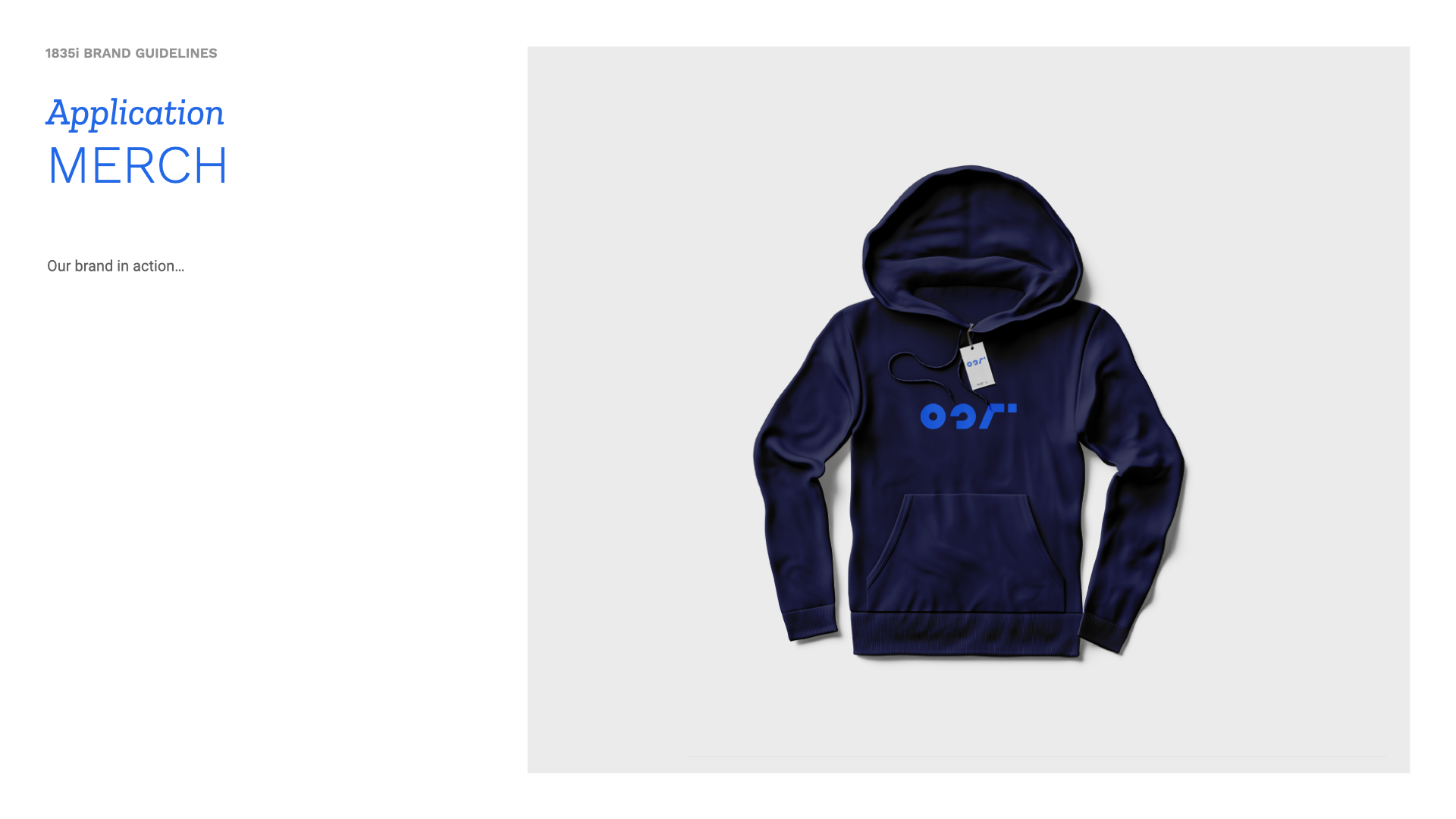
Office signage & merchandise
Physical brand expression
Video assets for investor / client outreach
Venture-scaling proposition made visual
Ongoing product design system
Venture wound down – brand outlasted it