



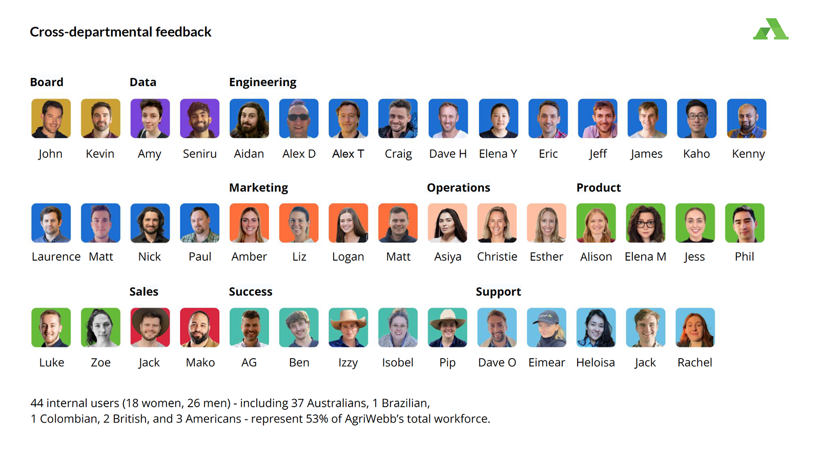
I led 44 internal interviews over two months, combining perception testing, a validated satisfaction instrument, screen comparisons, and competitor review to give AgriWebb its first evidence-based baseline for design.
Section 01 – The challenge
When asked about digital technology on farm, one Central West NSW farming couple put it simply:
"Frustrating and time-wasting... by the time you've figured out what's gone wrong, half a day is gone."
"We rely on them. We're so used to them."
Users today are shaped by polished, high-quality digital products – and expectations are rising fast. As AgriWebb scaled, the team had no shared sense of how its design was perceived internally or how it compared to the market. Decisions about visual direction were being made without evidence. We needed a clear-eyed baseline – and a foundation for what comes next.
Section 02 – The process
"I'm really excited about what you're doing and I'm really interested to see where we can go."
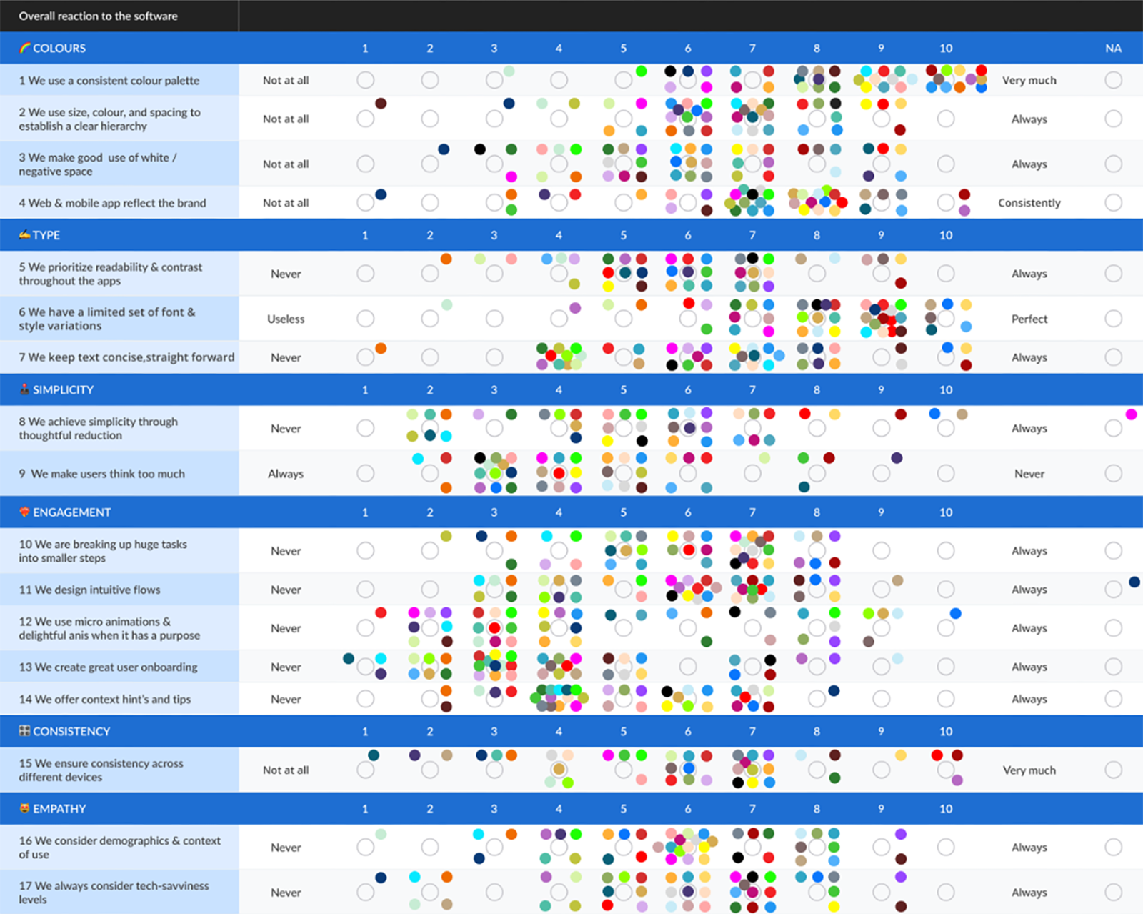
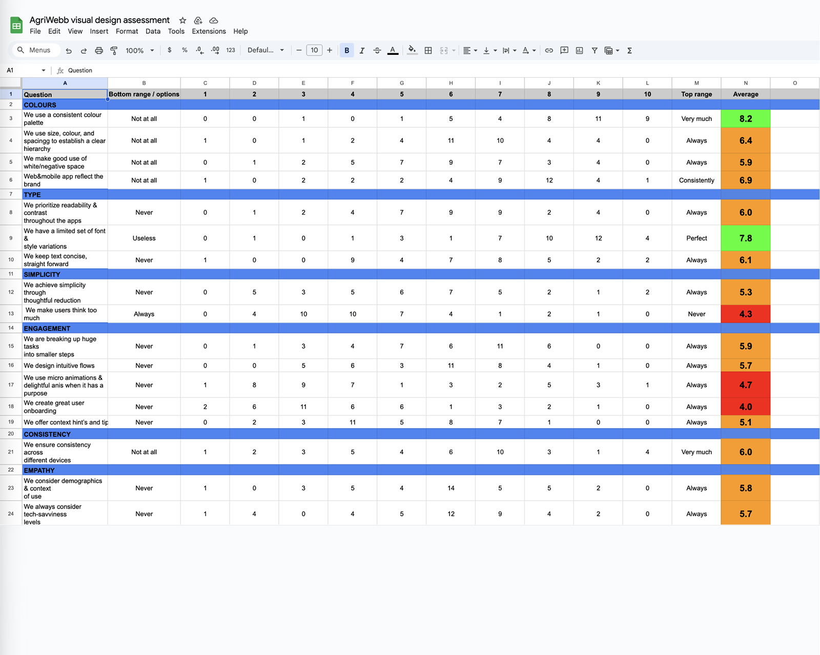
Over two months, I conducted 44 internal interviews (in-person and online) exploring visual design, layout, color, and style, which naturally broadened into overall user experience.
Each session used four research methods:
Perception testingRatings for importance and satisfaction, three-word descriptors, and open feedback on successes and pain points.

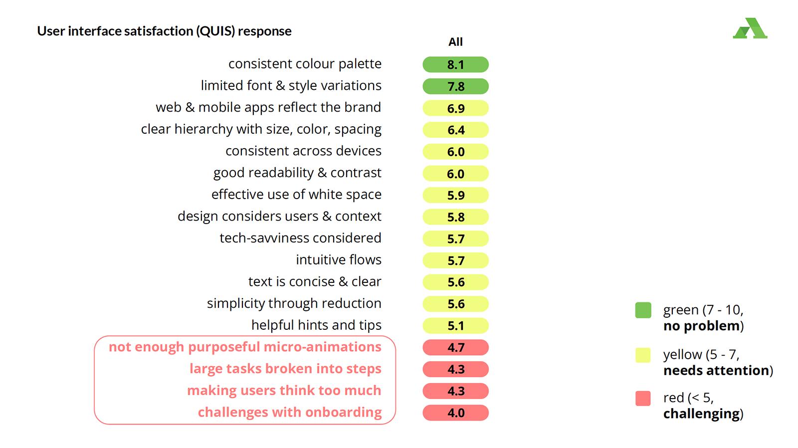
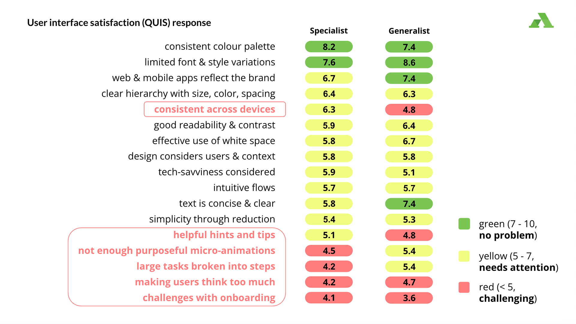
QUIS questionnaireA validated framework measuring technical system satisfaction, mapped to an urgency chart (green/orange/red).

Screen comparisonsSide-by-side evaluations of existing AgriWebb flows to uncover user preferences and rationale.
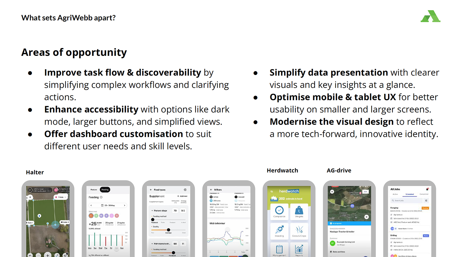
Competitor reviewBenchmarking nine competitor tools (including Mobble, Breedr, and Halter) to identify strengths, weaknesses, and key learnings.

Final presentation highlights
Section 03 – Outcome & impact
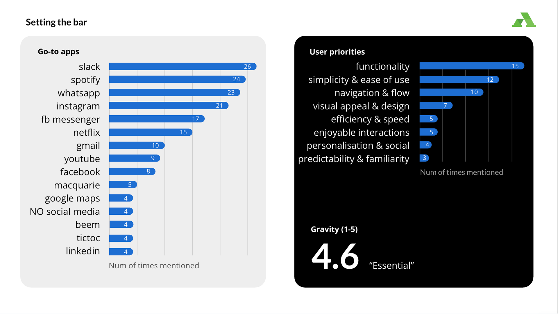
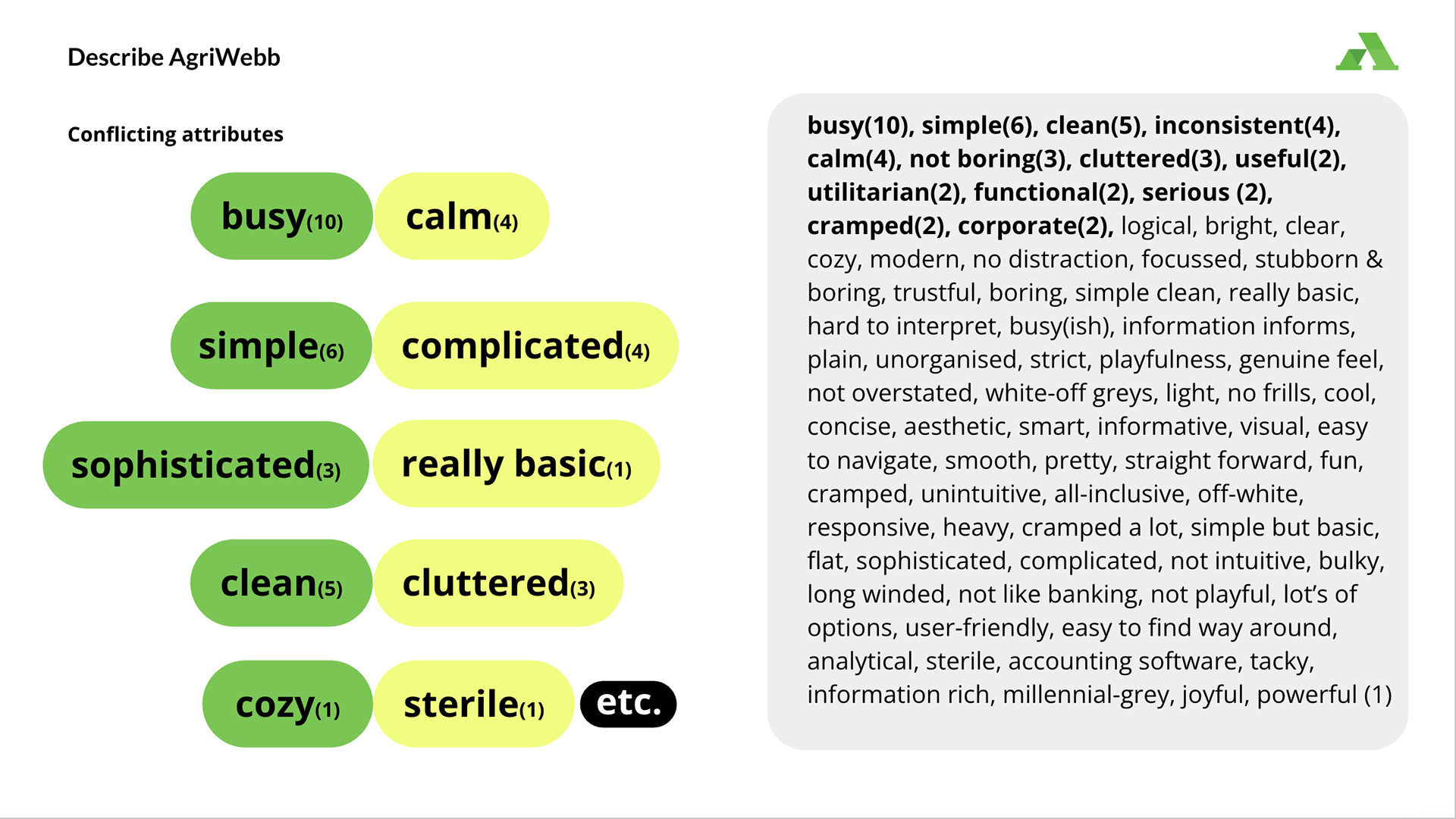
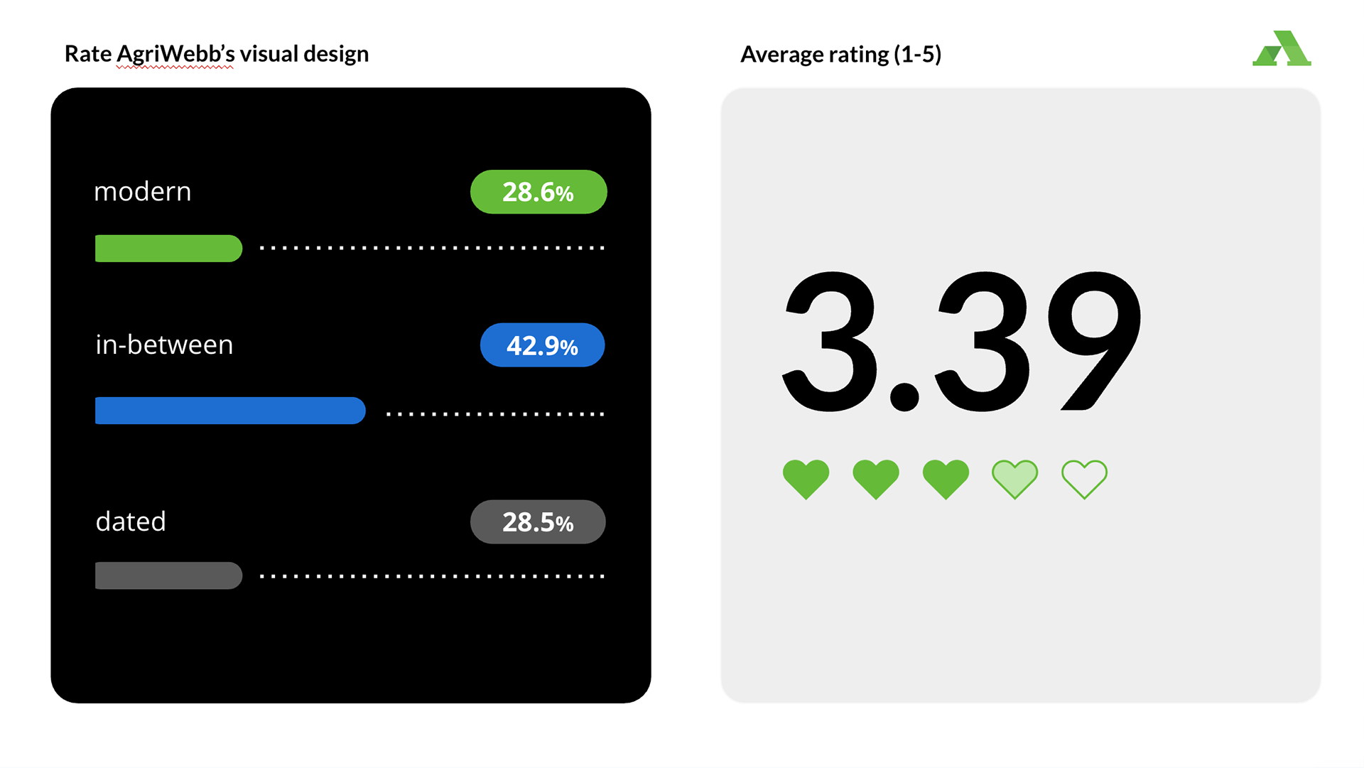
The interviews revealed a core tension: while AgriWebb is indispensable (4.6/5 rating), only 28.6% of users view it as modern. It is trusted, but doesn't feel like it.
"The minute-to-first wow factor is really lacking. We don't do a great job of rewarding the user the minute they're in. We want to create that – that was easy, I want to do this again."
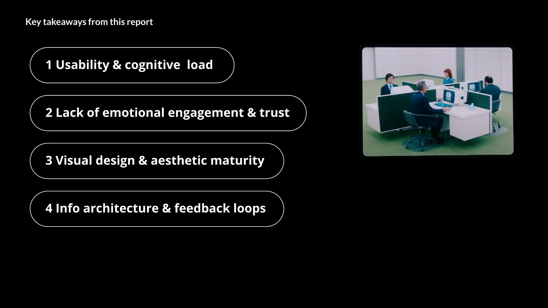
Four insights define the vision forward:
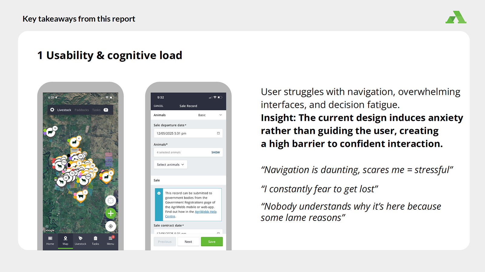
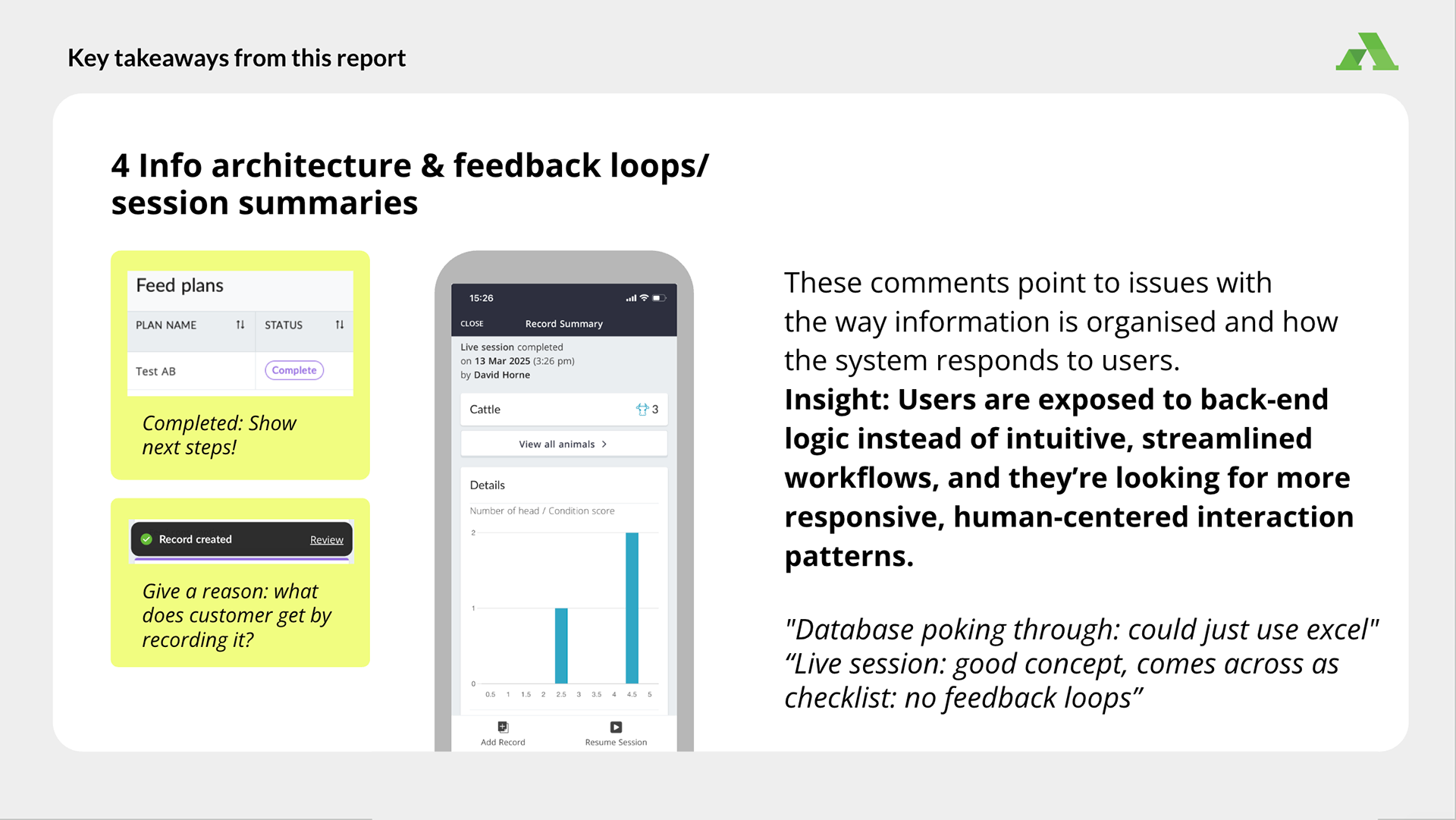
Anxious navigationLow QUIS scores in onboarding (4.0), cognitive load (4.3), and task decomposition (4.3) show users fear getting lost.
Emotionally flat UIDescribed as "grey" and "lifeless," the product lacks delight outside of key features like the map and drag-and-drop.
Map as core anchorUniversally praised across all roles, the map is the primary foundation for AgriWebb's visual language.
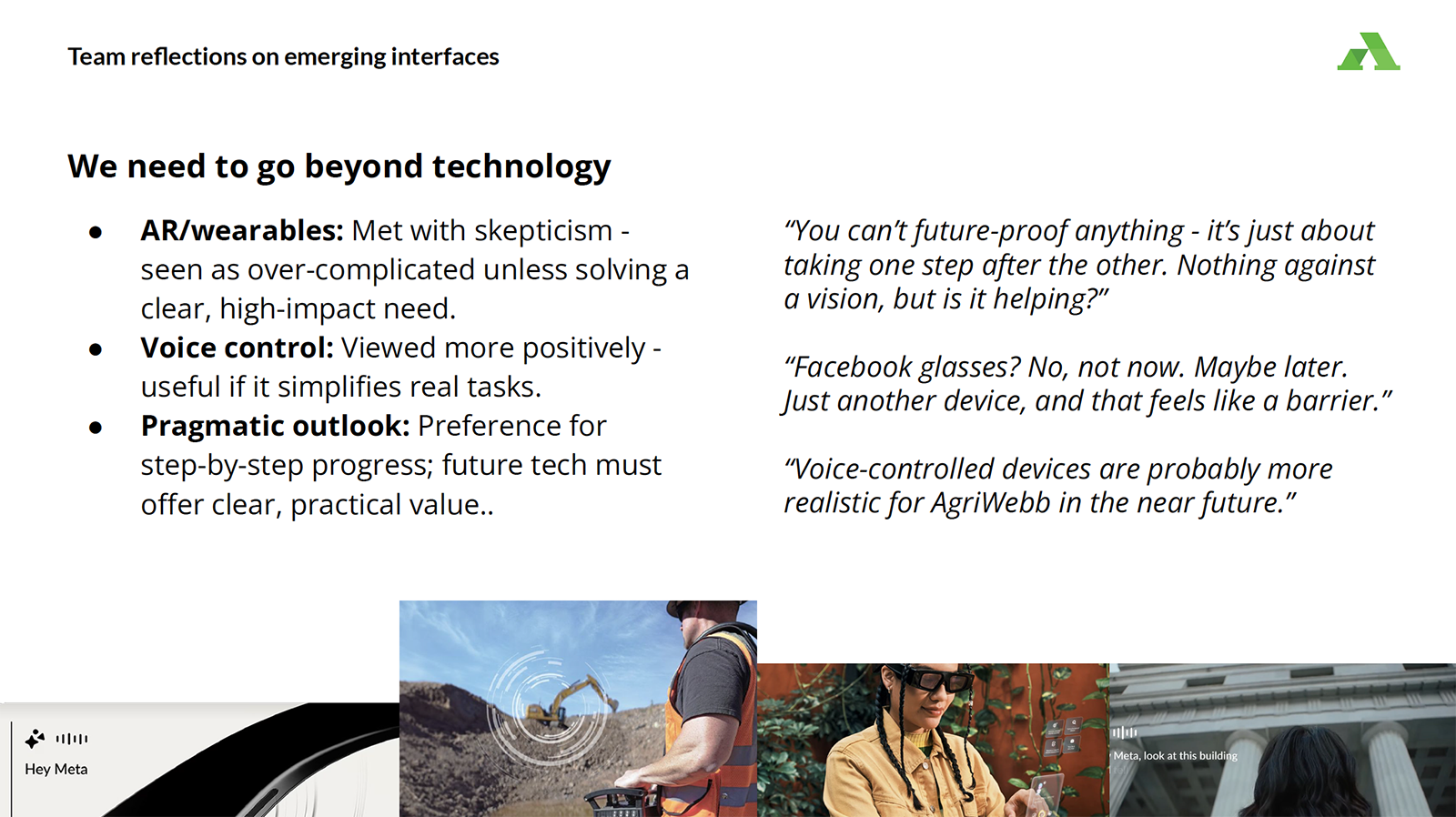
Higher expectationsWhile visually ahead of most direct competitors, AgriWebb falls short when compared to consumer benchmarks like Slack, Spotify, and Instagram.
Grounded in feedback from 44 users across the business, these findings replace assumptions with an evidence-based vocabulary and a prioritised design roadmap balancing quick wins with long-term structural changes.
"I always think we should just go for simplicity. Bigger text, bigger boxes – and then I would do away with anything that doesn't need to be there."