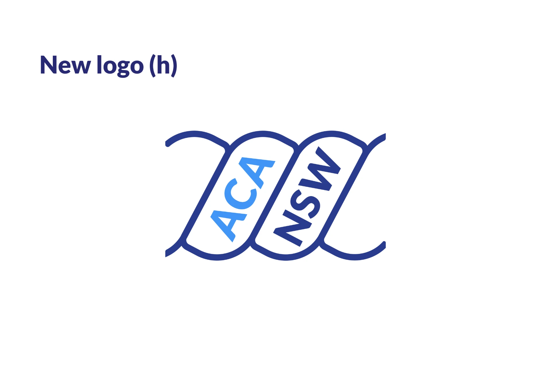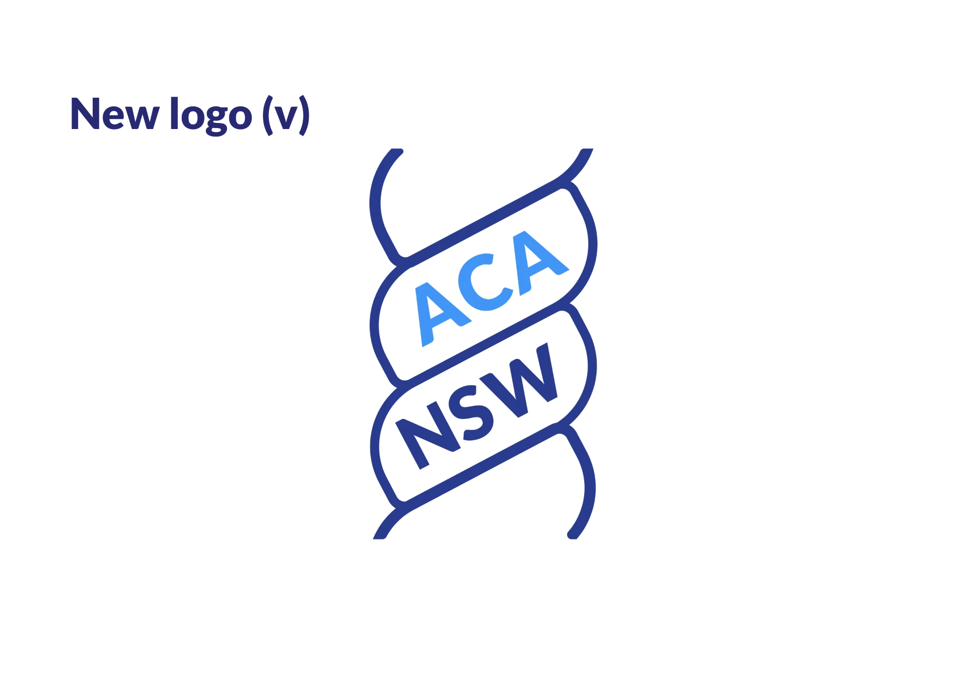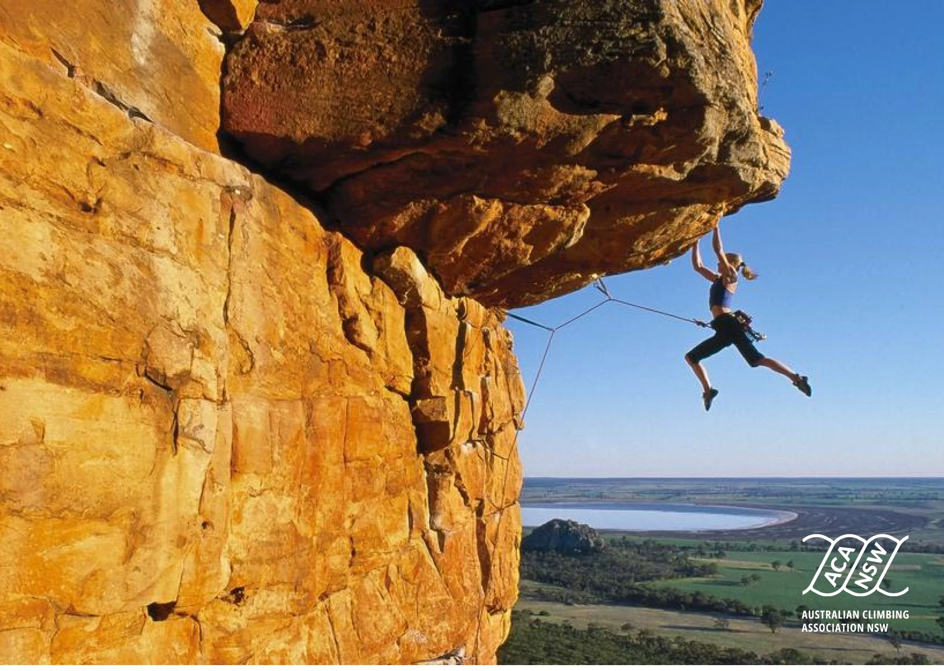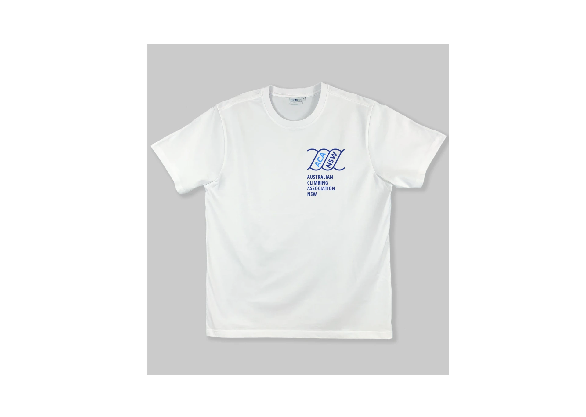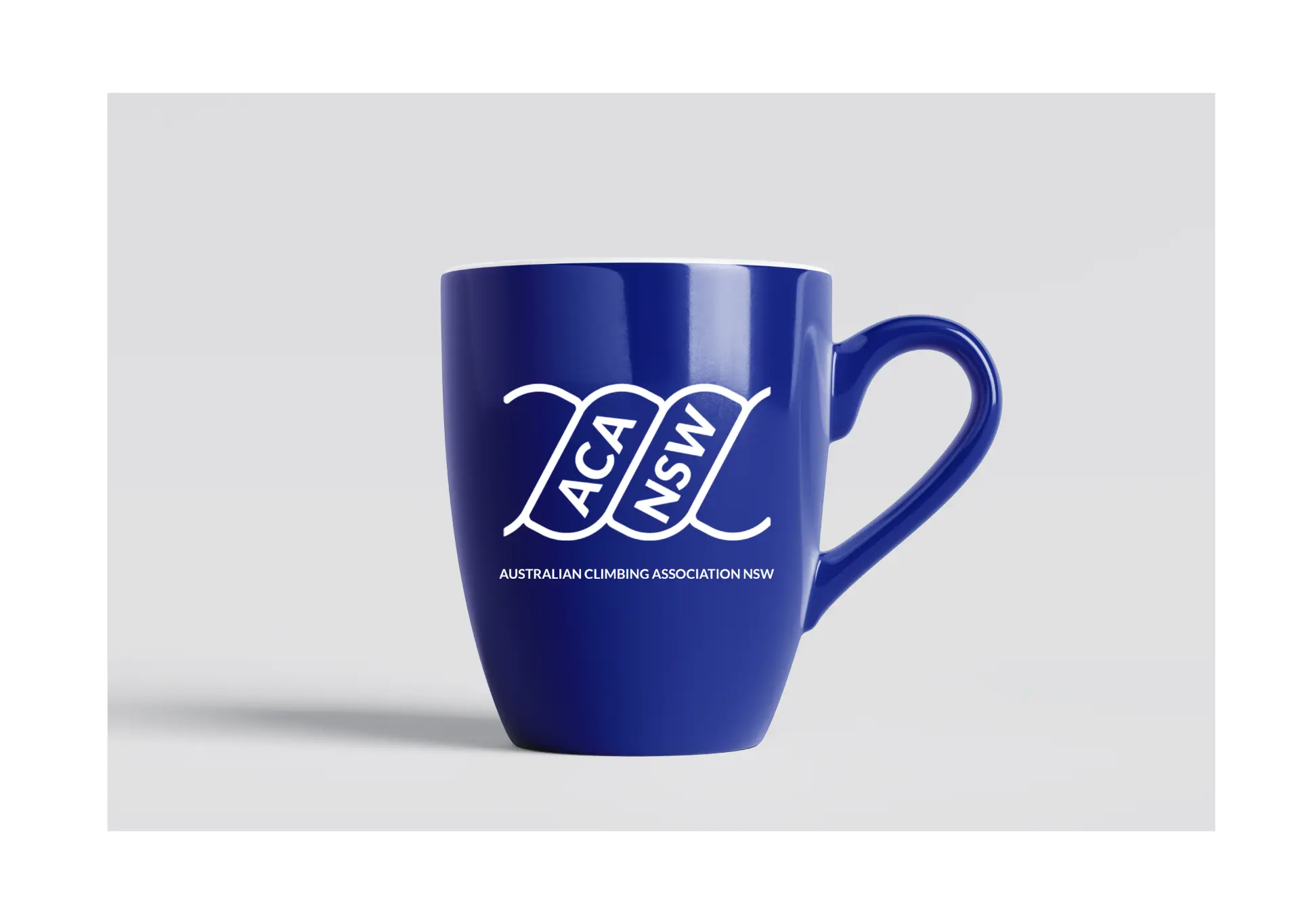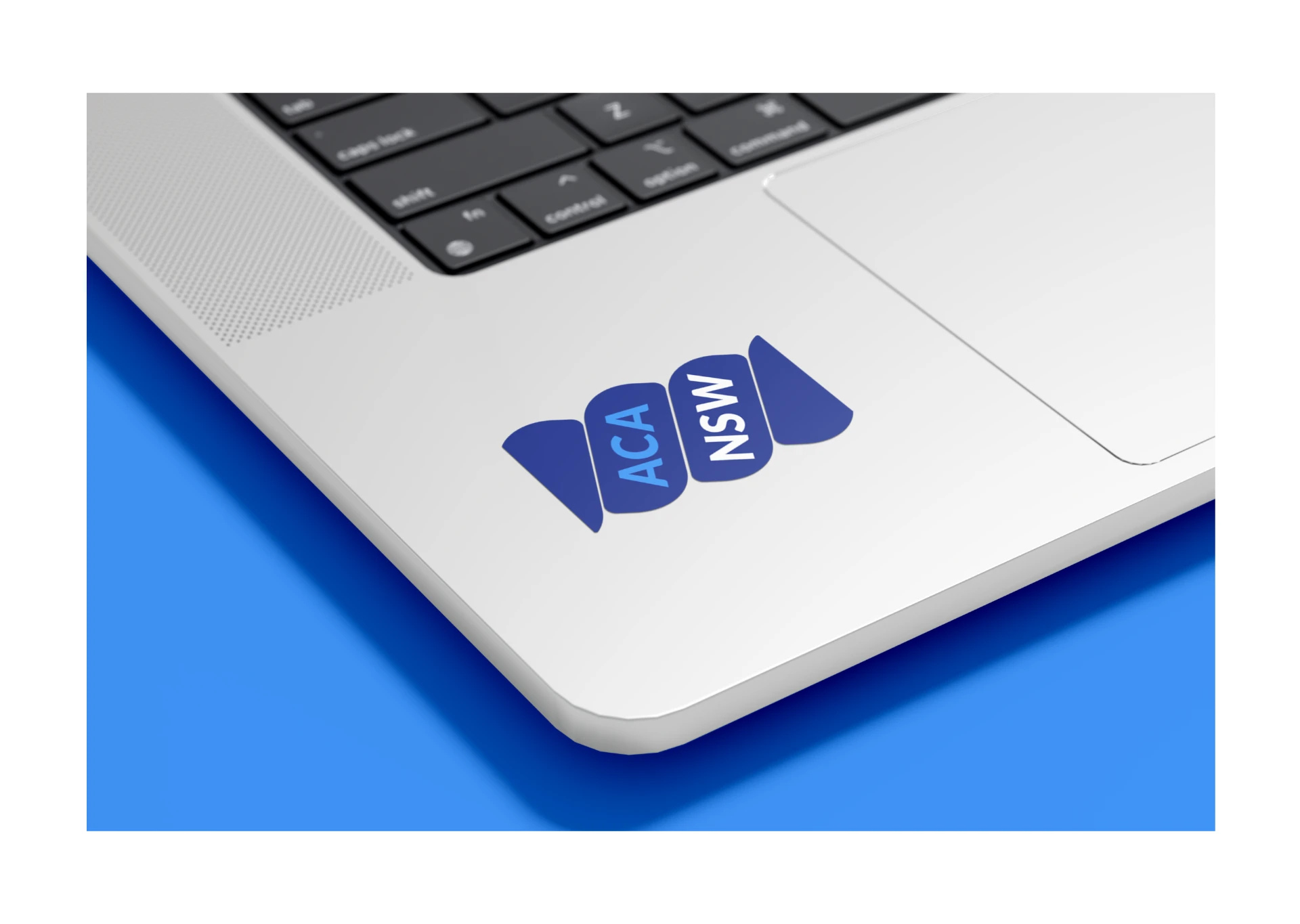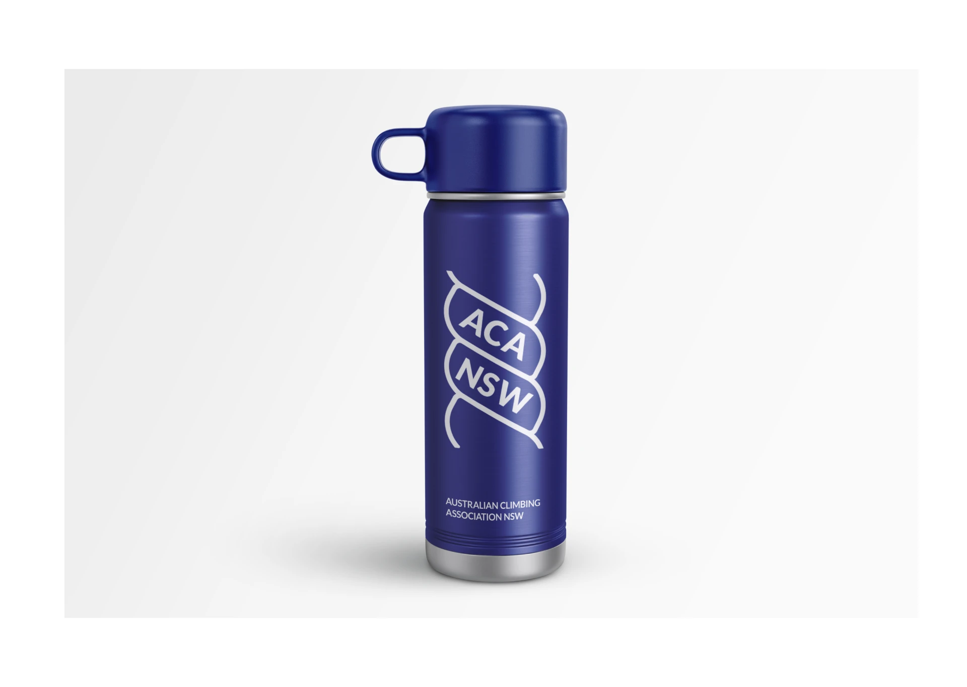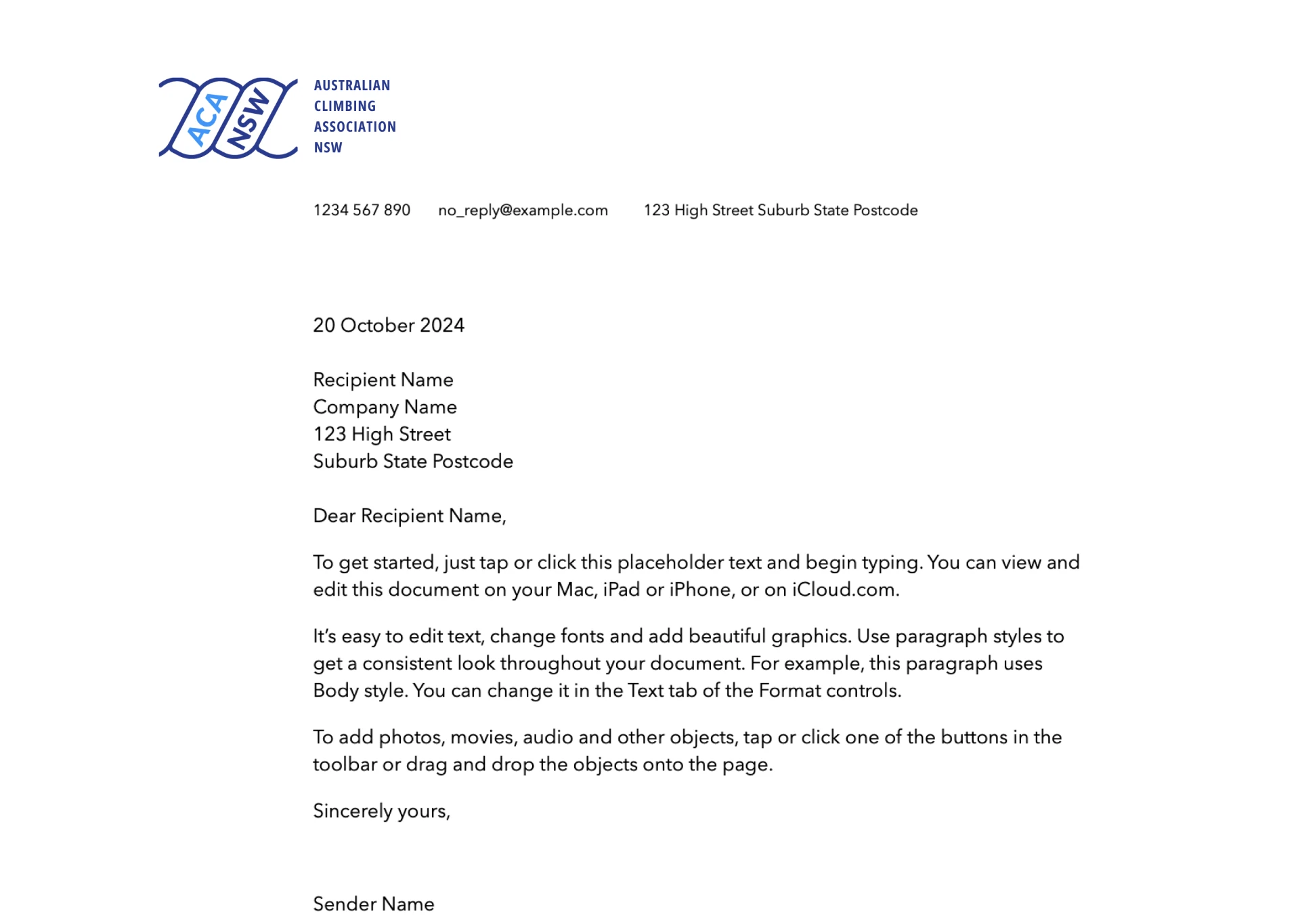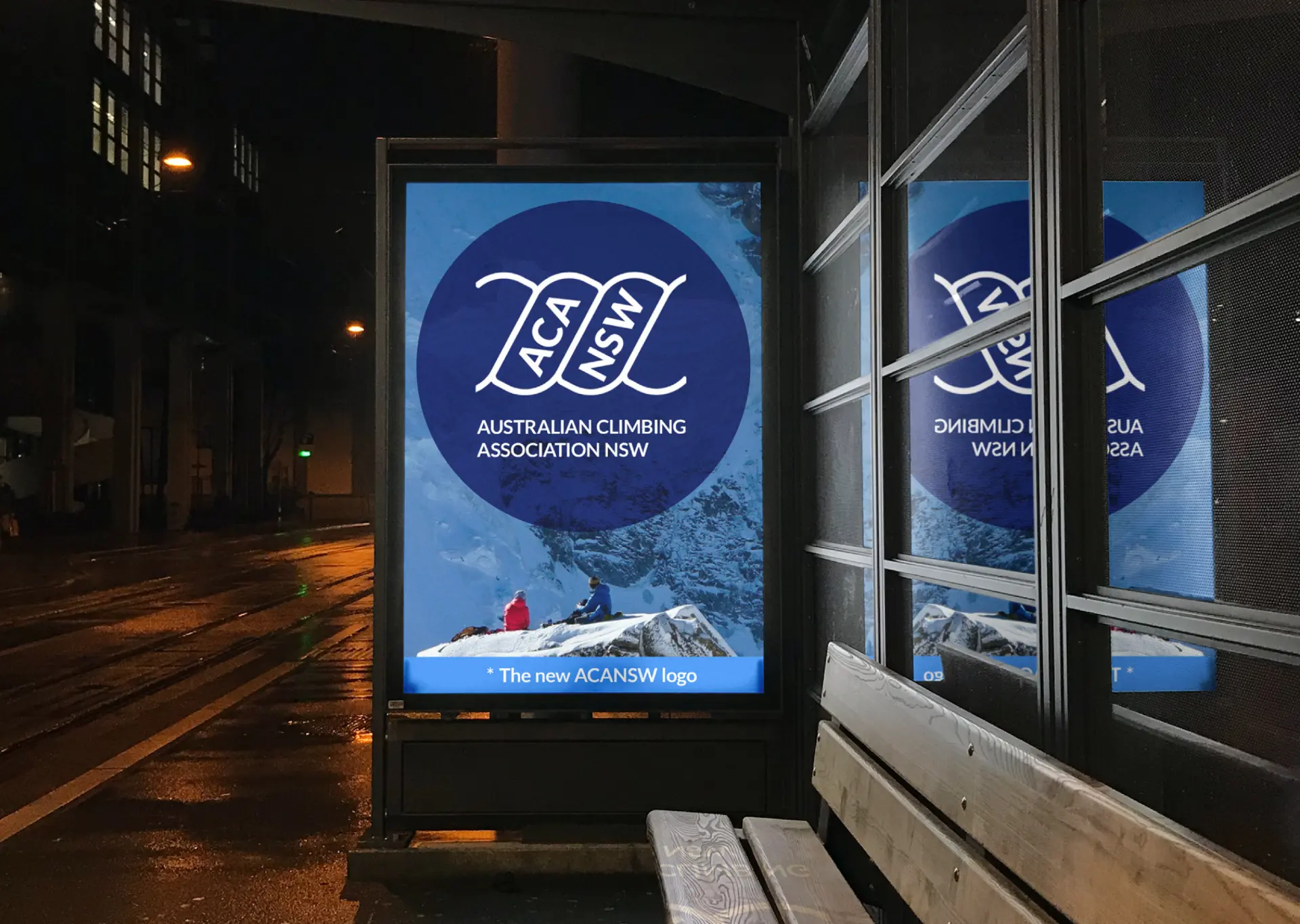


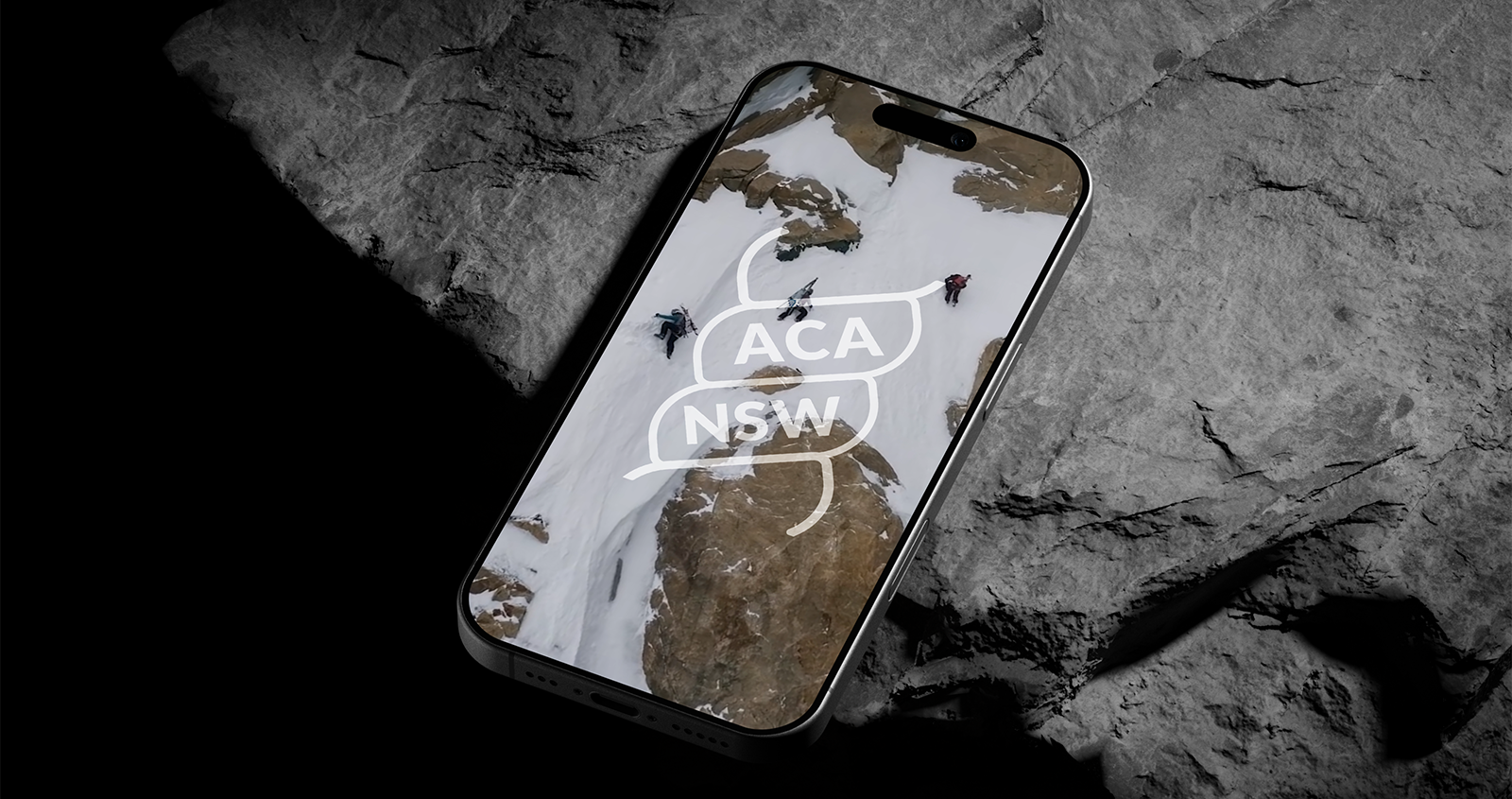
I designed ACA NSW's logo as a pro bono project in 2025, giving the state organisation an independent identity that stands on its own while still reading as part of the family.
with Alex Dess, AgriWebb
Section 01 – The challenge
In 2025, my colleague and avid mountaineer Alex Dess asked for my help giving the New South Wales section of the Australian Climbing Association its own visual identity. Working pro bono, I used the ACA's existing logo as a starting point, exploring directions that let the NSW section chart its own path while still honouring where it came from.
Section 02 – The process
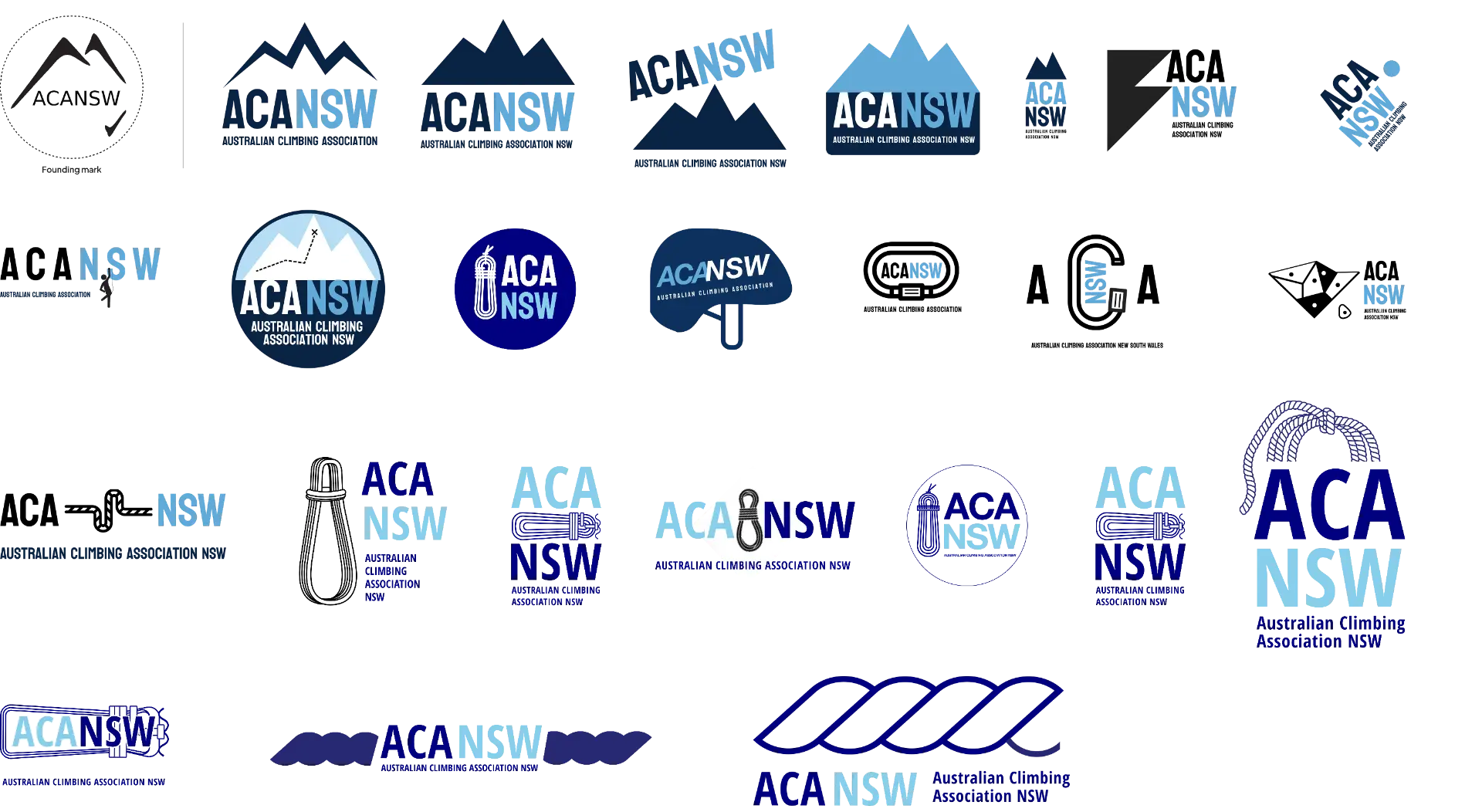
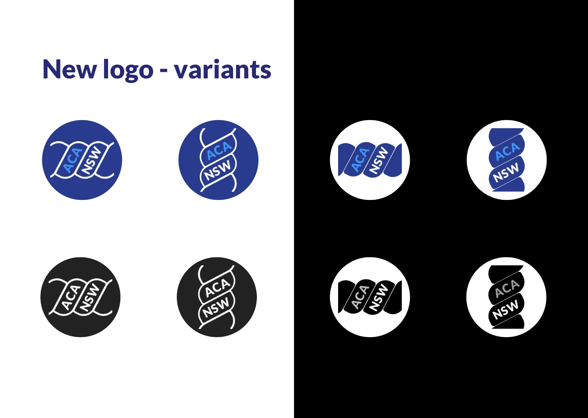
Hey, just a heads-up. They loved your designs. They really liked the bottom right one.
Section 03 – Outcome & impact
Logo and logotype usage guide
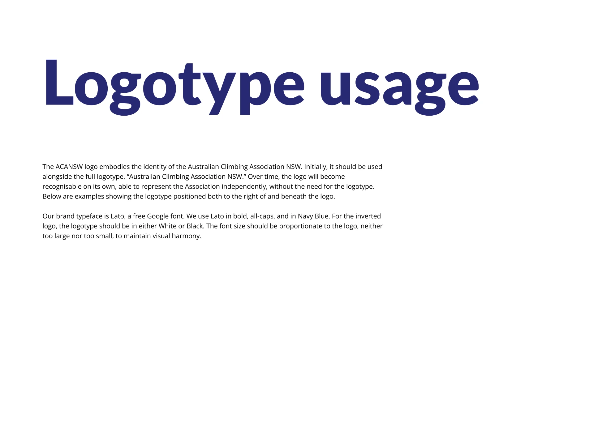
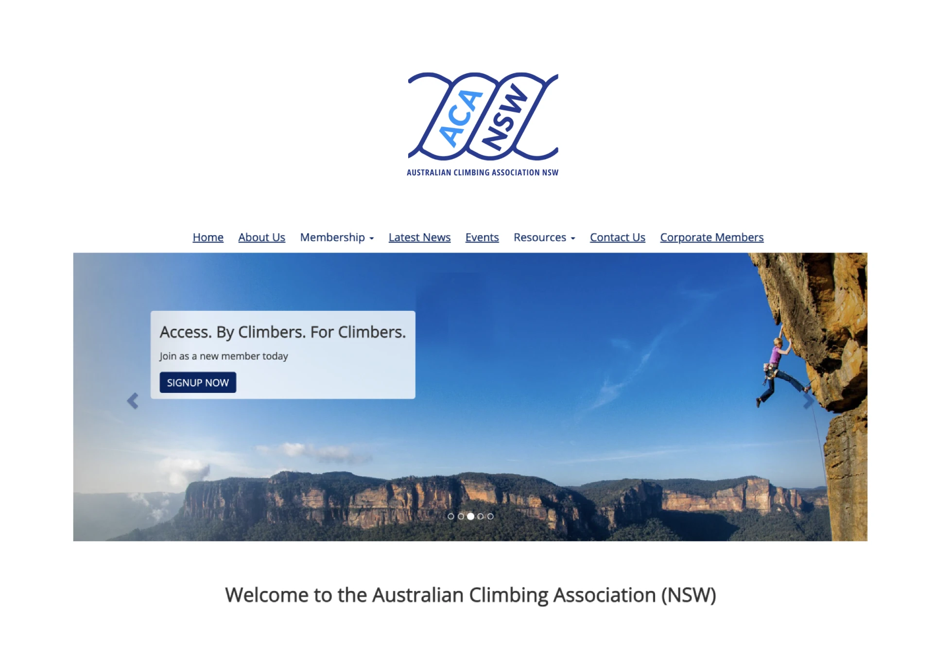
The ACA NSW logo represents the identity of the Australian Climbing Association NSW. Initially, the logo should be accompanied by the “Australian Climbing Association NSW” logotype. The logotype can be positioned either below the logo or to its right.
Typeface
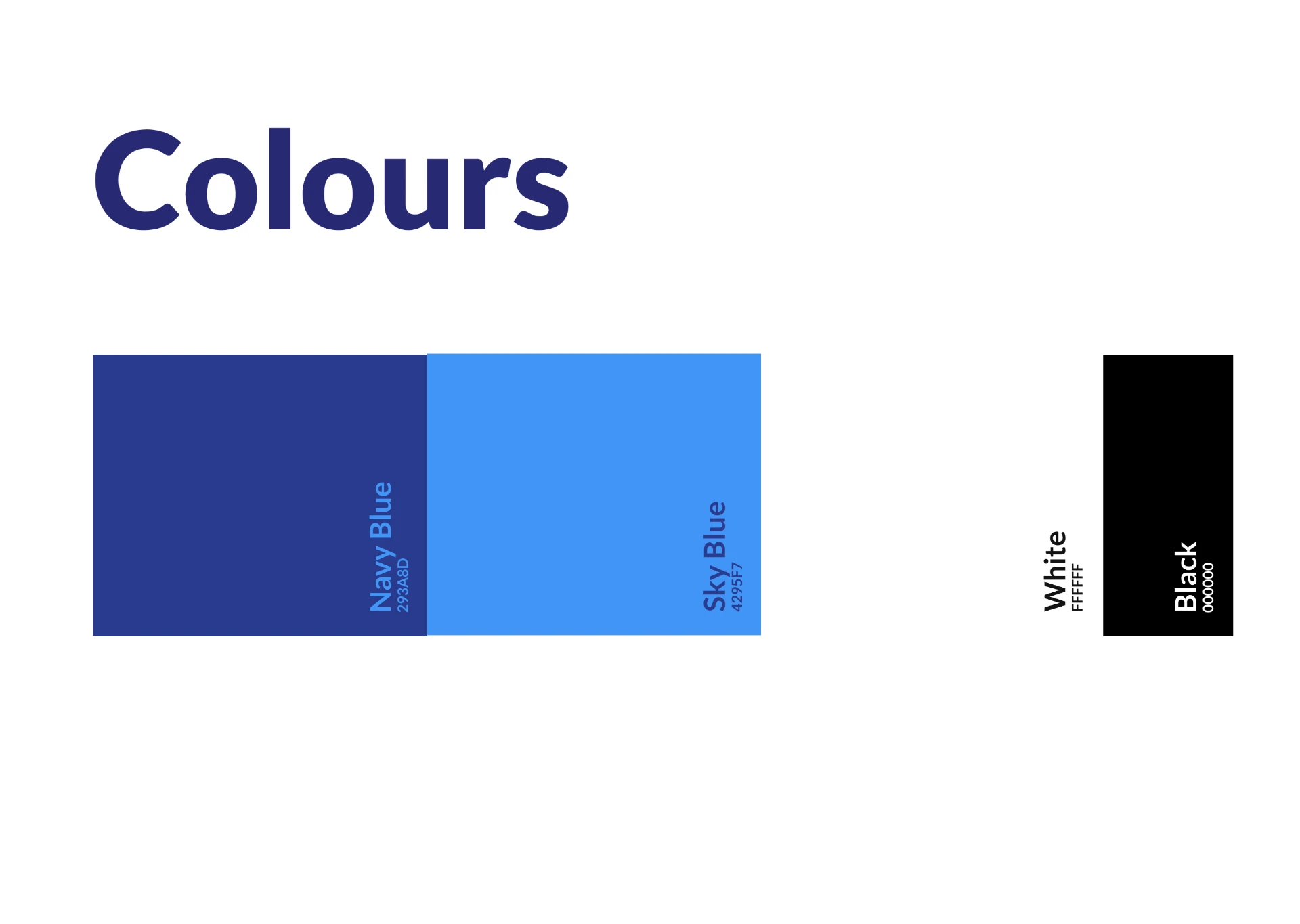
Our typeface is Lato, a free Google font. The font size should harmonize with the logo – neither too large nor too small. Use bold, all-caps Lato in the same color as the primary logo variant: Navy Blue, Sky Blue, White, or Black.
Logo-only recognition
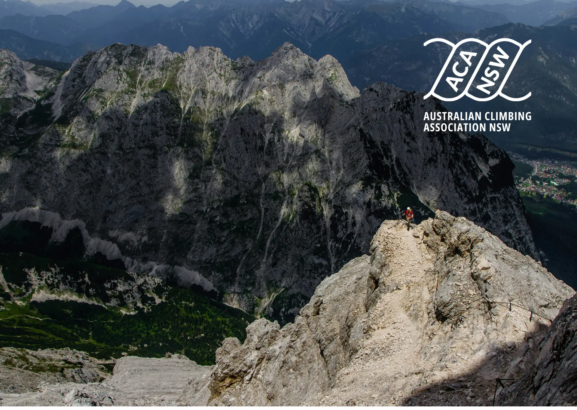
Over time, the ACA NSW logo will become recognizable on its own, representing the association without needing the accompanying logotype.
Drag or swipe to explore →